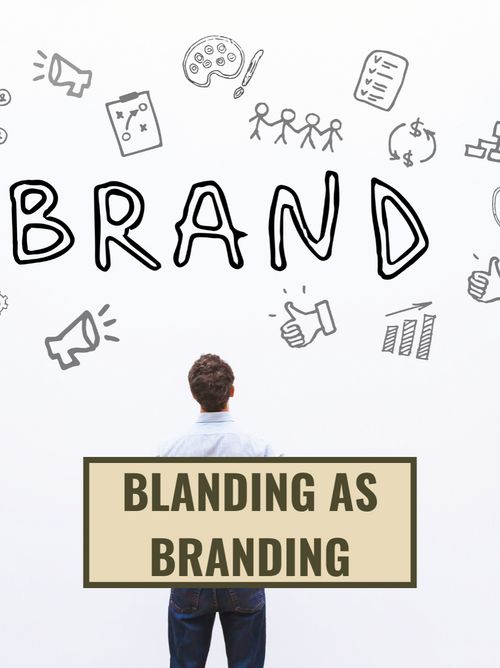
Stop branding, start blanding
Dec 29, 2021 · 2 mins read
0
Share

The internet is a noisy place. Brands wonder: how do we develop brand recall in non-intrusive ways?
Save
Share
One potential answer: blanding. Blanding is a design process of moving from complex to simple.
Save
Share
The Evolution Of The BBC Logo Over The Years. The BBC logo was first in italics. Then they tried round corners and played with some colors. Finally, they settled on an ultra-minimalist block design with no italics.
Save
Share
Another big company that underwent blanding: Google. Over the years, Google has made its logo ever more simple. Over time they've removed all curves and all gradients.
Save
Share
The current Google logo's sans-serif font is simple and translates well to different screens: laptops, phones, smartwatches, TVs, and more.
Save
Share
Blanding is getting popular for three reasons. First, designs that are simple yet bold tend to pop out.
Save
Share
Second, brands have a few microseconds to make an impression - complex designs don't work in the attention economy.
Save
Share
Third: adoption to upcoming tech. If/when smart glasses and VR become mainstream, simple designs will be the easiest to transfer to new mediums!
Save
Share
Blanding requires a delicate balance between simplicity and uniqueness. Too simple and you're forgettable, too unique and you're too difficult to remember. But when in doubt, it's wise to tilt toward minimalism.
Save
Share
Bottom line. Brand recall will get harder as there are more and more brands to recall. In such a crowded marketplace, going minimal may be an important growth hack. If you want to be remembered - make your customers' job easier!
Save
Share
0