What are the types of layout grids?
Dec 22, 2021 · 2 mins read
0
Share
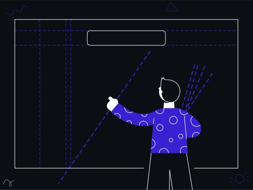
A layout can be defined as an invisible internal structure that governs the elements placed within the interface. It ensures that no matter how many screens you're designing, they all have the same internal structure and appear consistent. A layout is a structure formed by grids.
Save
Share
Grids are rows and columns spanned across the entire screen canvas, which divides it into many equal parts. These parts are called modules, and what flows through the space between these individual modules is called a gutter.

Save
Share
One of the primary uses of the layout is to make sure your design stays responsive across different screen sizes, densities, & platforms. High-density screens have more pixels per inch than low-density. UI elements of the same pixel dimensions appear larger on low-density screens
Save
Share
There are 4 types of grid layouts in the layout grid system.
Manuscript Grid:
It's the simplest and the single column grid, which comprises a rectangular area. The area can be filled with content like images, blocks of texts, and it constitutes large margins and blocks.

Save
Share
Multicolumn Grid:
They deal with placing the content (illustrations and text both) into separate columns. The size & number of columns depend on the layout you want to provide, & the number can vary from two to six. The value of the gutter should be consistent across the grid.

Save
Share
Multicolumn Grid:
It is easier to figure out which column to place the text in and which columns should be allocated for the images or illustrations. Newspapers are a good example.
Save
Share
Modular Grid:
The modular grid has both rows & columns,together they create a matrix structure of cells with an appropriate gutter. It is mainly used to handle complex website or app layouts, and the way our apps are placed on our phones is the work of using a modular grid.

Save
Share
Custom Grid:
You can use different-sized modules to establish a visual hierarchy based on their importance in a similar context. Also, ensure to keep the gutter length optimum in your layouts.

Save
Share
An essential element of any layout is the vertical end margins. The width of these vertical margins varies according to the screen size, and make sure to only expand this width up to appropriate sizes. Make sure to place your grid elements with enough vertical margins properly.
Save
Share
You may have realized by now the structure, various types, and usage of layouts in design. All the layouts explained above can be used on websites based on the site's choice & nature.
Originally Published at ProCreator Blog, Written by —Rajat Bagree.
Reach us at:
Save
Share
0