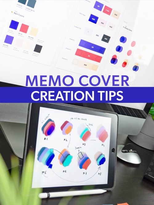
How to make a great Memo cover
Jan 19, 2022 · 2 mins read
0
Share

Select an image that portrays the main subject, theme or idea that your Memo is all about. For example, the book "How Not to Die" is all about a vegan diet, so a photo of someone eating healthy would be great. Faces do the best!
Save
Share
Images can be sourced from photos you have taken personally or from copyright-free image websites like Unsplash.com, Canva.com or many others.
Save
Share
Size your image. The ideal Memo Cover is 1000 pixels X 1334 pixels and this can be rotated either portrait or landscape. You can also proportionally reduce that size if needed.
Save
Share
Choose a Thumbnail Title that is between 1-4 words. It should be easy to understand and as short as possible so that it doesn't take over the cover.
Save
Share
Recommended fonts are simple, legible, sans-serif fonts like Gibson, Oswald or Arial.
Save
Share
Highlighting your title helps it to stand out from the background image. Just be sure that the font color and highlight color are not too similar or hard to read.
Save
Share
Colors that tend to work well for text backgrounds are Red (#C7140C), Orange (#FD7A3C), Magenta (#BE078C), Green (#1FAA3C), Blue (#238EBC) and purple (#781AAC)
Save
Share
Arrange your text so that the image still stands out and there are no faces covered by text. Also aim to keep your text centered or off the edges of the image as much as possible so they do not get cut off.
Save
Share
Simple shapes like squares, rectangles or even just a line can add a nice eye-catching visual element to your cover.
Save
Share
Remember: The best file types for Memo covers are .PNG or .JPG (and about 500kb in size). Know that transperent backgrounds are no supported. Any clear layers will appear as white.
Save
Share
0