What is Leading in Typography?
Dec 28, 2021 · 3 mins read
0
Share
What is Leading in Typography?
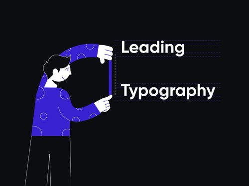
Leading is the difference between the baseline of the types. In simple terms, the distance between the two lines of text is leading. Leading is extensively being used in the areas of User Interface Design. Correct spacing can make or break the interface.
Save
Share
Readability is an important aspect that should be considered when we talk about designing interfaces. To ensure readability, there must be enough distance between the bottom of the words of the previous line and the top of the words of the next line.
Save
Share
Typography isn’t just choosing fonts, text size, & color; it takes care of the content on the screen. Right Leading ensures that the text is easy on the eyes. Text is easy to ready if the Leading is neither too loose nor too tight, as it conveys the message you intend to convey.
Save
Share
Purpose of leading:
Sometimes the way interfaces are designed is too heavy to the eyes. For a dark interface, it is recommended to use greater Leading and light-weighted typeface to enhance the readability of the interface.
Save
Share
Similarly, different colors add different kinds of weight to the screen, making it difficult to even look at the interface. It can be fixed using correct spacing between the lines, leading.
Save
Share
How is leading measured in typography?
There is no correct way to measure leading. It is based upon the context and the interface being used. Leading is measured in the sense of tight or loose Leading. A tight leading is generally used in print media and newspapers.
Save
Share
They are used where they have to provide too much information in a smaller amount of space. It also gives them an authentic look at the same time, making it chaos for the eyes, decreasing readability.

Save
Share
Loose Leading is easy on the eyes, ensuring a pleasurable reading experience. Whereas, too much line spacing also makes it difficult to read sometimes, as the eye will take longer to travel. Leading should always be measured in terms of the font being used.
Save
Share
What is negative Leading in typography?

Save
Share
How much Leading shall you use?
Various parameters impact the question, how much Leading is enough?

Save
Share
0