An aesthetic horror story
Nov 09, 2023 · 2 mins read
0
Share
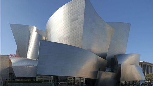
This is how modernist architects tried to be original and created hell on Earth:
Save
Share
The modernist builders were obsessed with two things: originality and capturing the essence of modernity in our buildings. Being modern, said the famous Dutch architect Oud, meant one must be “opposed” to traditional architecture.
Save
Share
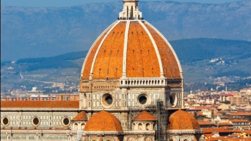
Rybczynski, an Urbanism professor, writes that old masters didn’t care for originality. Brunelleschi, the man whose 597 year old dome is still the largest in the world, borrowed liberally from “Roman ruins.” Rybczynski: “Imitation was at the heart of the Italian Renaissance.”
Save
Share
By making Originality their One True God, modernists cut off their own source of inspiration. Their “international style” tried to be utilitarian without understanding the profound utility of beauty. They said “form follows function” and forgot the function of aesthetics.
Save
Share
Human creativity cannot be repressed, only regrettably squandered. That’s what postmodernists did. Bored of their father (modernism) but estranged from their grandfather (tradition), they invented new shapes that produced shock but never awe. The kids aren’t alright.
Save
Share
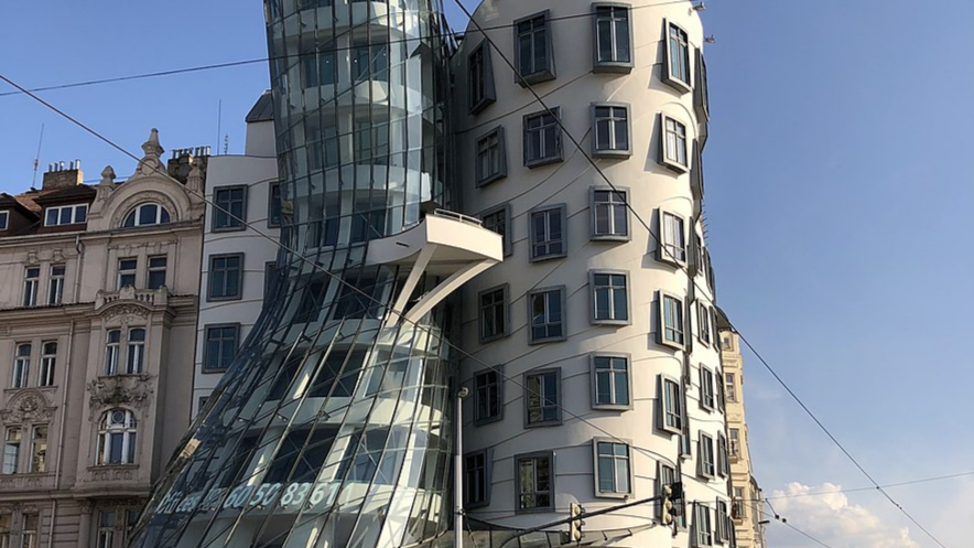
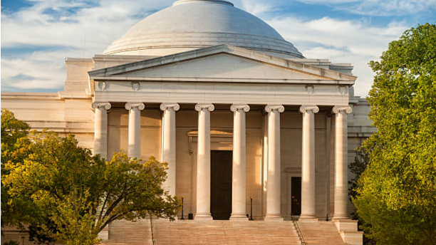
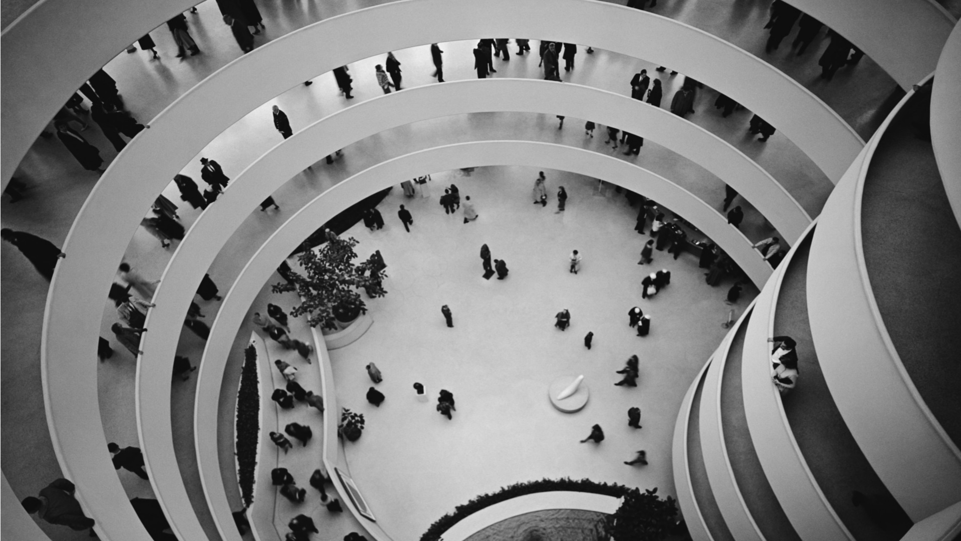
A study in contrast: National Gallery of Art designed by J.Pope and the Guggenheim Museum designed by L.Wright. Rybczynski writes the former was built by “imitating and modifying old forms,” the latter via “unrestrained invention.” And the differences are starker on the inside.
Save
Share
Pope uses “ionic porticos” to tell us the gallery is a “secular temple of art.” Explore at your own pace and there are “plant-filled conservatories” to relax in. But Guggenheim is a “continuous helical ramp” with no shortcuts and bad lighting. Its design makes you a “prisoner.”
Save
Share
Yale commissioned modernists to build galleries and colleges in the 1960s . Less than 50 years later, all of them “underwent major renovation at a cost far exceeding that of the original construction”(Rybczynski) . "We’ll hurt your eyes and your wallet" - a modernist, somewhere.
Save
Share
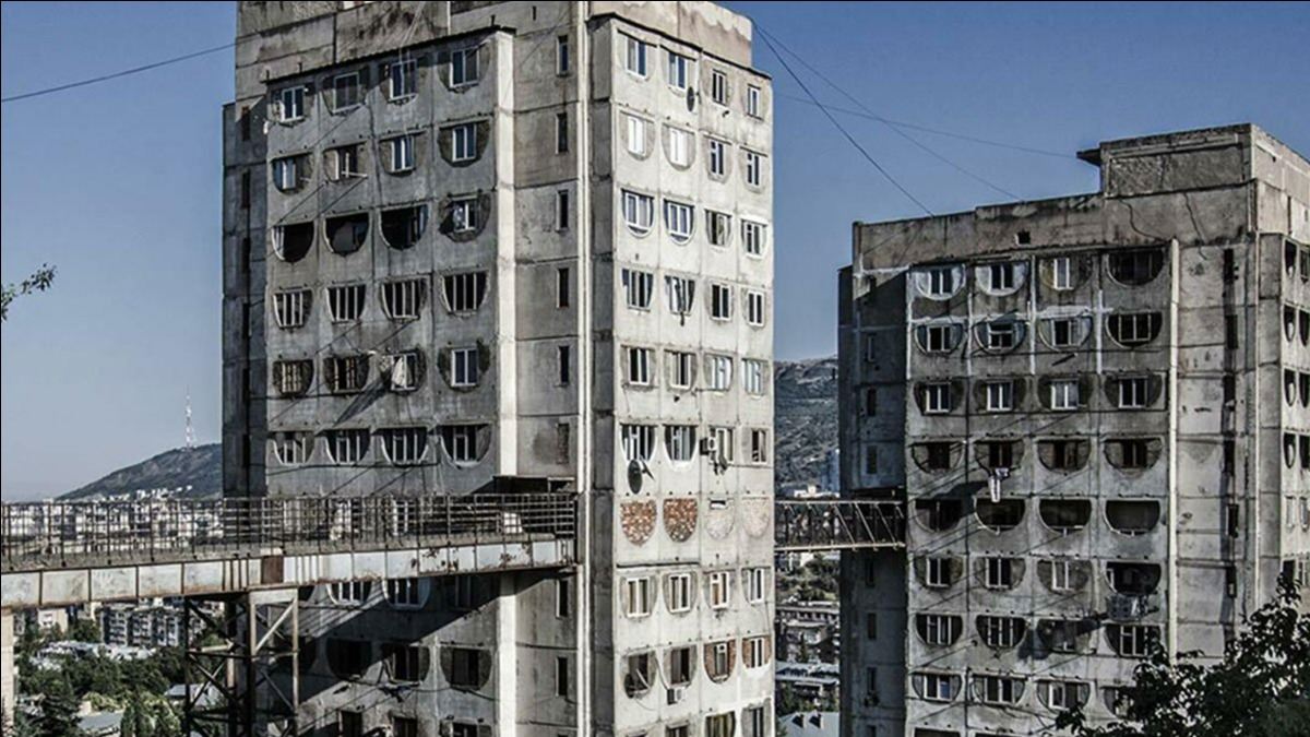
Dont get excited about new materials too quickly. Brutalists went all on in reinforced concrete, thousands of structures were built, and then we learnt “steel & concrete” are terrible together. Rybczynski: “Concrete cracks, steel rusts.” Yesterday’s innovation, today’s eyesore.
Save
Share
Just because the “fascist regimes” liked classical aesthetics, the modernists leaned even more heavily towards their international, concretized, “antitotalitarian” style. The modern world looks the way it does because to prefer beauty apparently makes you politically incorrect.
Save
Share
0